Every efficiency metric in support can be improved by making it slightly harder to reach a person. Fewer tickets, higher containment, snappier answer rates — all of them move the right way if customers give up earlier. That is not a cynical edge case. It is the default failure mode of measuring load without measuring how the load felt.
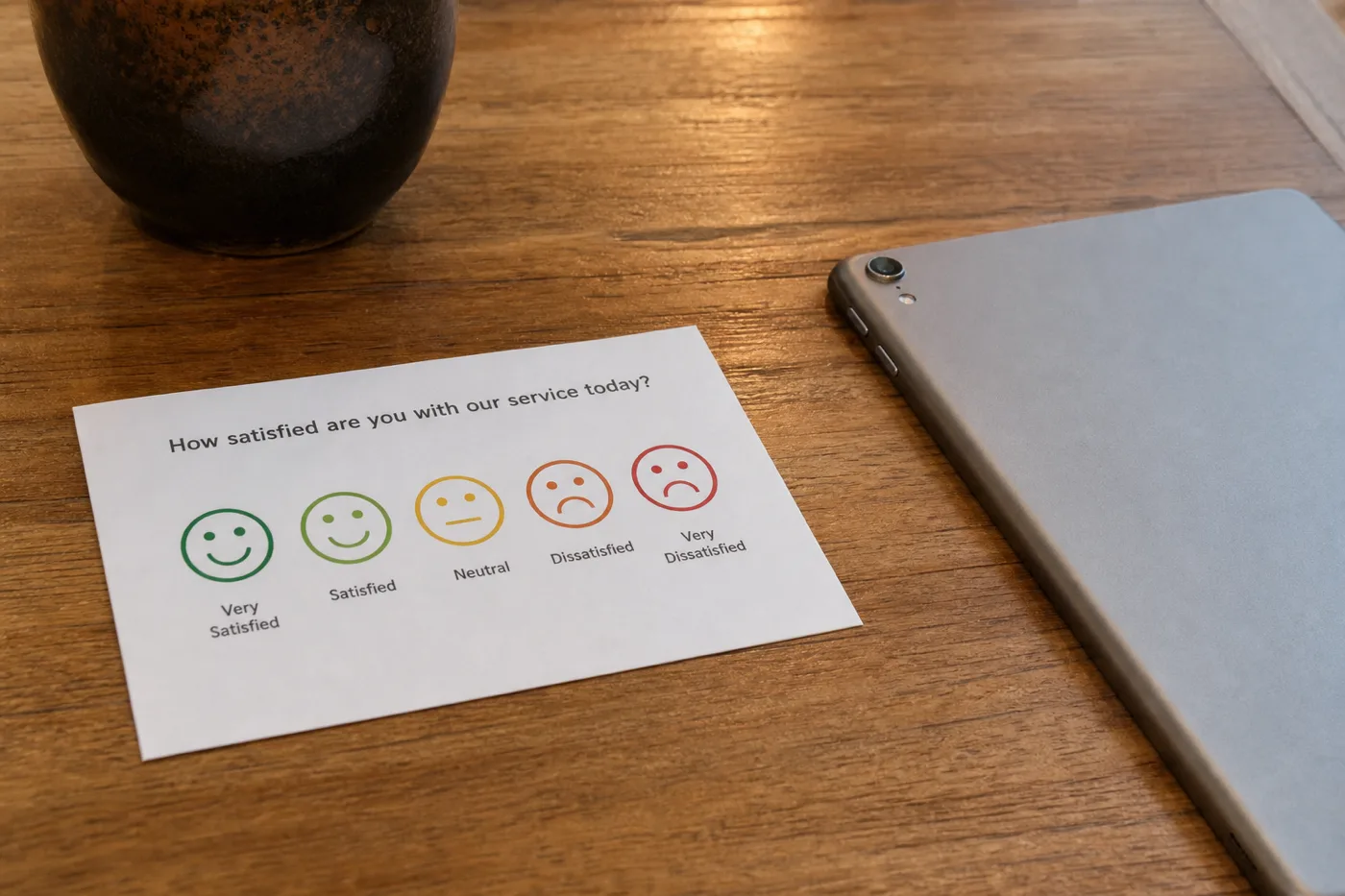
So the rule is simple enough to print above a dashboard: satisfaction travels with every automation number, or the automation number does not get shown. CSAT is usually the right instrument because it is interaction-level. NPS moves too slowly and for too many reasons to attribute to a widget.
What “travel with” means in practice
It means same window, same slide, same decision. If you present a month of falling tickets, the satisfaction series for that month sits beside it — not in an appendix, not “we’ll look at quality next quarter.” If one number is used to argue for expansion, the other is in the argument.
- Same date range for volume and satisfaction.
- Same survey instrument as the pre-launch baseline.
- Segment bot-resolved vs human-resolved when the tool allows it.
- Call out sample size when responses are thin — a silent week is not a triumph.
The four pairings that stay honest
| Automation number | Satisfaction check | Healthy pattern |
|---|---|---|
| Normalised ticket volume ↓ | CSAT flat or up | Likely displacement |
| Answer / resolution rate ↑ | CSAT flat or up; refusals sensible | Coverage improved |
| Containment ↑ | CSAT flat; escalations still clean | Bot ending work without trapping people |
| Tickets ↓ + CSAT ↓ | — | Attrition until proven otherwise |
The last row is the one teams under-report. Falling contact with falling satisfaction is not a savings story. It is customers learning not to ask. That shows up later as churn or public complaints, attributed to anything except the support project that made asking hard.
A shape worth keeping in your head
relative to baseline
Illustrative, not measured: ticket count alone cannot distinguish these; satisfaction can.
If your reporting culture rewards only the ticket bar, you will eventually ship the bad pair. The chart is a reminder for the meeting, not a KPI target.
When satisfaction is noisy
Small volumes produce jumpy scores. That is not a reason to drop the metric; it is a reason to widen the window, avoid week-to-week theatre, and treat sudden drops as tripwires rather than optimisation targets. Sentiment proxies from the product can play the same alarm role — useful for “something changed,” weak as a scoreboard.
Also separate “did not answer the survey” from “was satisfied.” Non-response is common after frictionless resolutions and after abandoned ones. Look at response rate shifts; a collapse in who bothers to rate you is itself a signal.
What to change when the pair disagrees
- If volume fell and CSAT fell: inspect handoff friction and refusal quality before celebrating savings.
- If answer rate rose and CSAT fell: check whether refusals dropped because grounding got looser.
- If CSAT fell only on bot-resolved threads: fix content gaps and escalation context, not agent scripts.
- If both held steady: keep filling the refusal list — that is how the pair improves together.
For the dashboard habit that keeps these numbers from lying in isolation, read analytics without fooling yourself. For the volume side of the pair, keep deflection measurement tied to a real baseline.
The shortest version
Automation numbers without satisfaction are incomplete in a direction that flatters the tool. Make the pair a reporting rule, not an aspiration. When they move together the right way, you can trust the efficiency story. When they do not, you have found the problem early — which is the entire point of measuring.